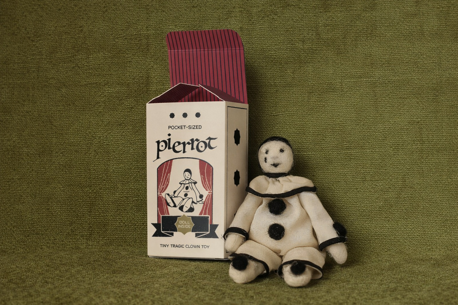
Pocket Pierrot
TOOLS USED
Adobe Suite
YEAR
2025/2026
PROJECT TYPE
Packaging Design, Illustration
ROLE
Lead Designer
The Pocket Pierrot is a personal project born from my love of making small, needle-felted figures during the 2025 Christmas break. What began as a quiet, hands-on practice; spending the holiday season crafting tiny felted mice, quickly evolved into a broader design exploration. As my crafting became a slight obsession, I became interested in how these figures might live beyond the making process, which led me to design packaging specifically for them.
Inspired by vintage toy boxes, the packaging is designed to frame and showcase the pierrot as a collectible toy, blending nostalgia with something handmade. The project brings together illustration, structural packaging design, and tactile making, treating each felted figure as both a toy and a keepsake.
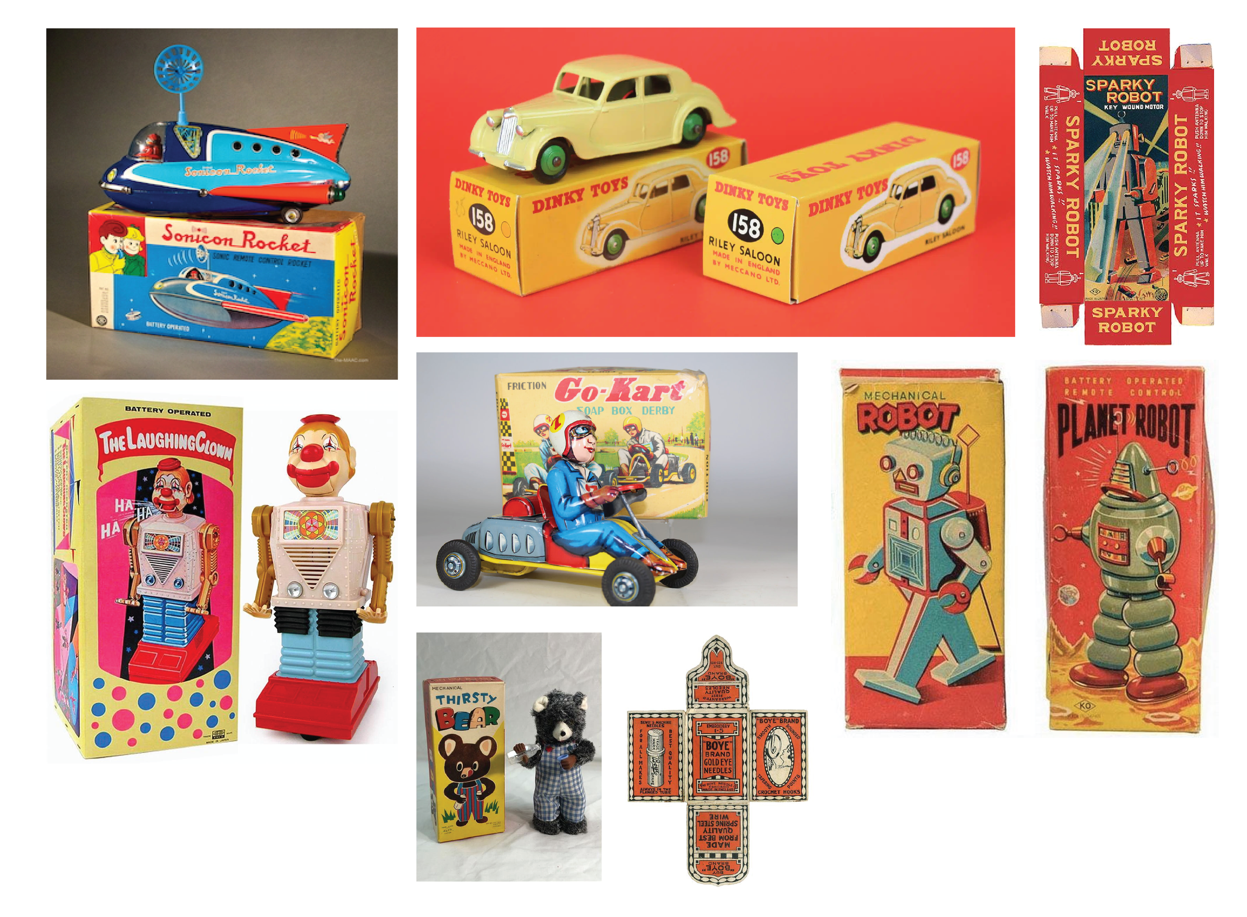
I started by collecting images of vintage toy packaging that depicted illustrated figures of what was inside. I knew I wanted that to be a feature in the final design.
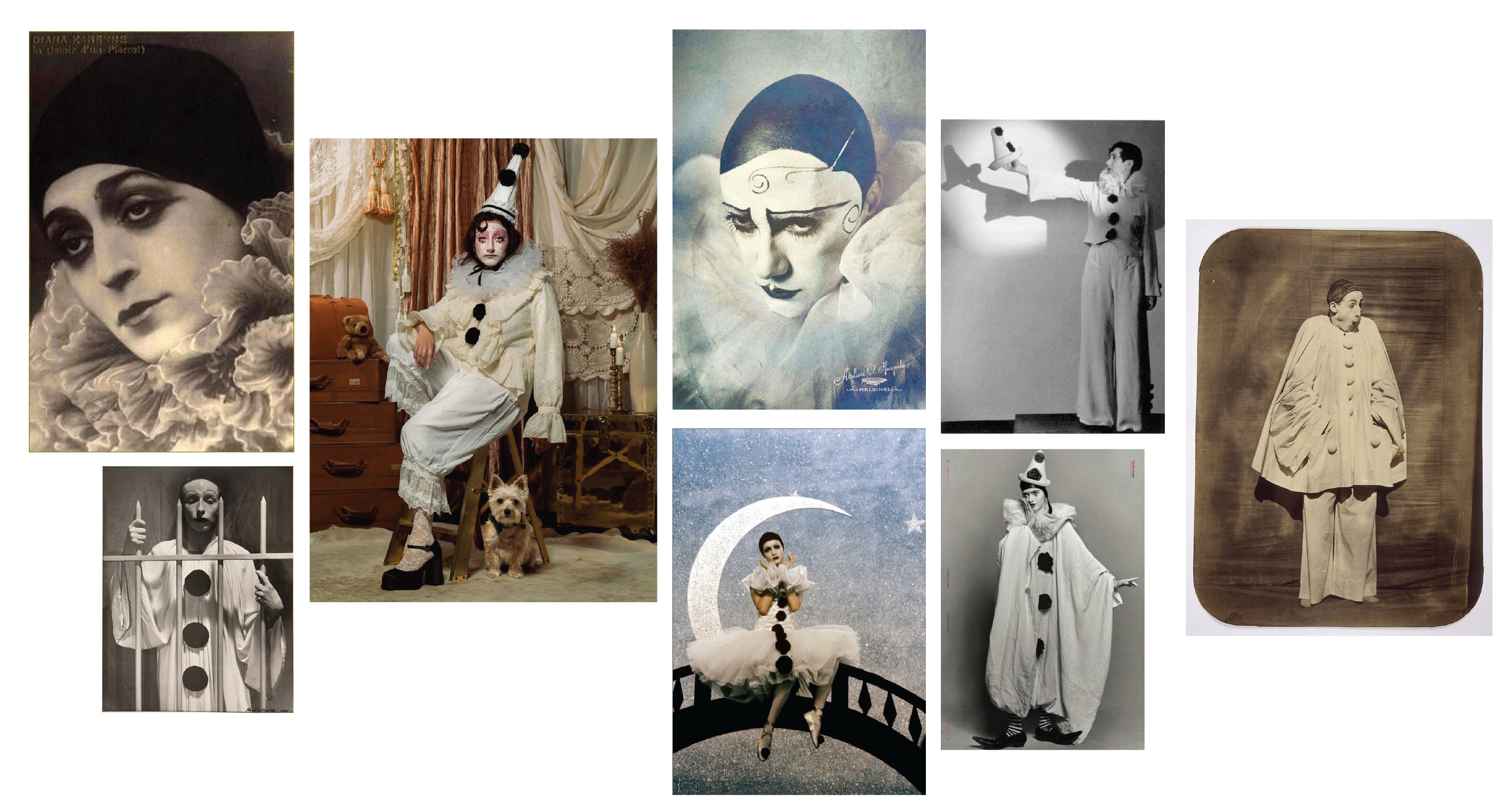
Vintage toys are often full of colour, playfulness, and brightness, and I was drawn to the idea of juxtaposing those visual queues with what lived inside the packaging. The pierrot, traditionally known as the “sad clown,” stands in contrast to the classic circus clown. He’s traditionally stripped of colour, typically dressed in white with black pom-poms. This contrast felt meaningful and intentional to the project. Growing up, small pierrot figures were always present in my home, as well as in my Oma’s house, which gave the character a personal and nostalgic significance for me.
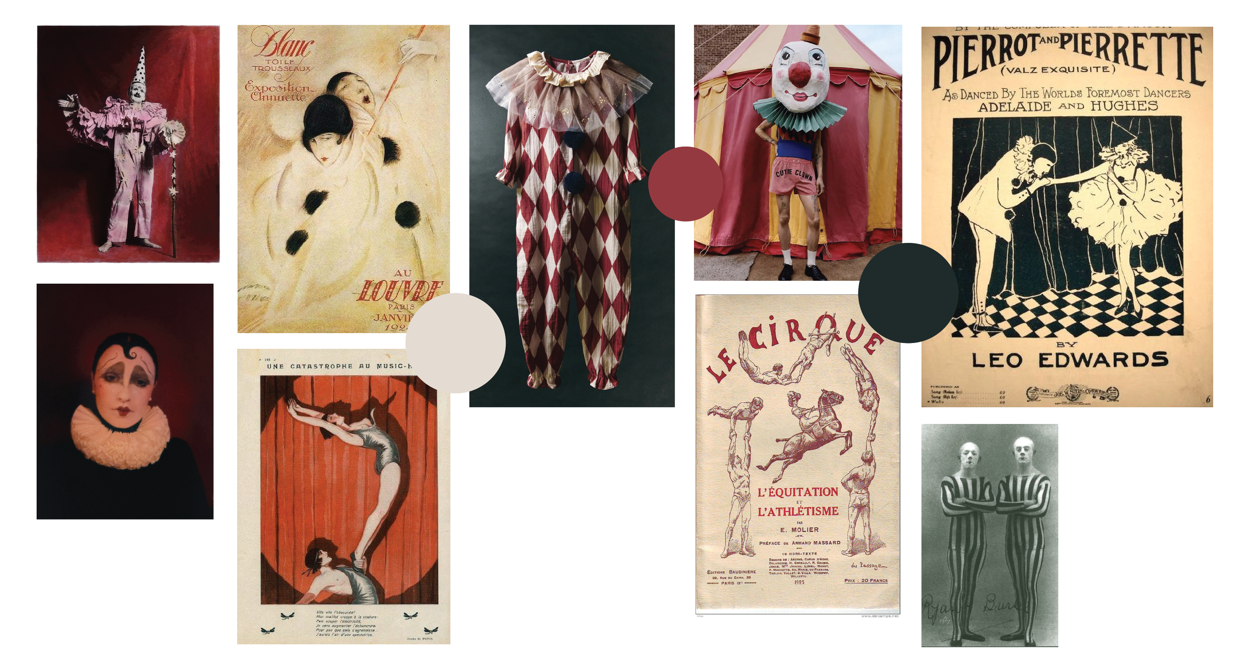
The visual cues of the pierrot felt naturally connected to the striking patterns and textures found throughout European vintage circus culture. Elements like bold stripes, velvet and satin textures, harlequin prints, strong shadows, and celestial motifs (stars and moons) carry a sense of mystery and intrigue. These references helped shape the visual language of the project, as well as colour palette, surrounding the pierrot with a world that feels theatrical, nostalgic, and intriguing.
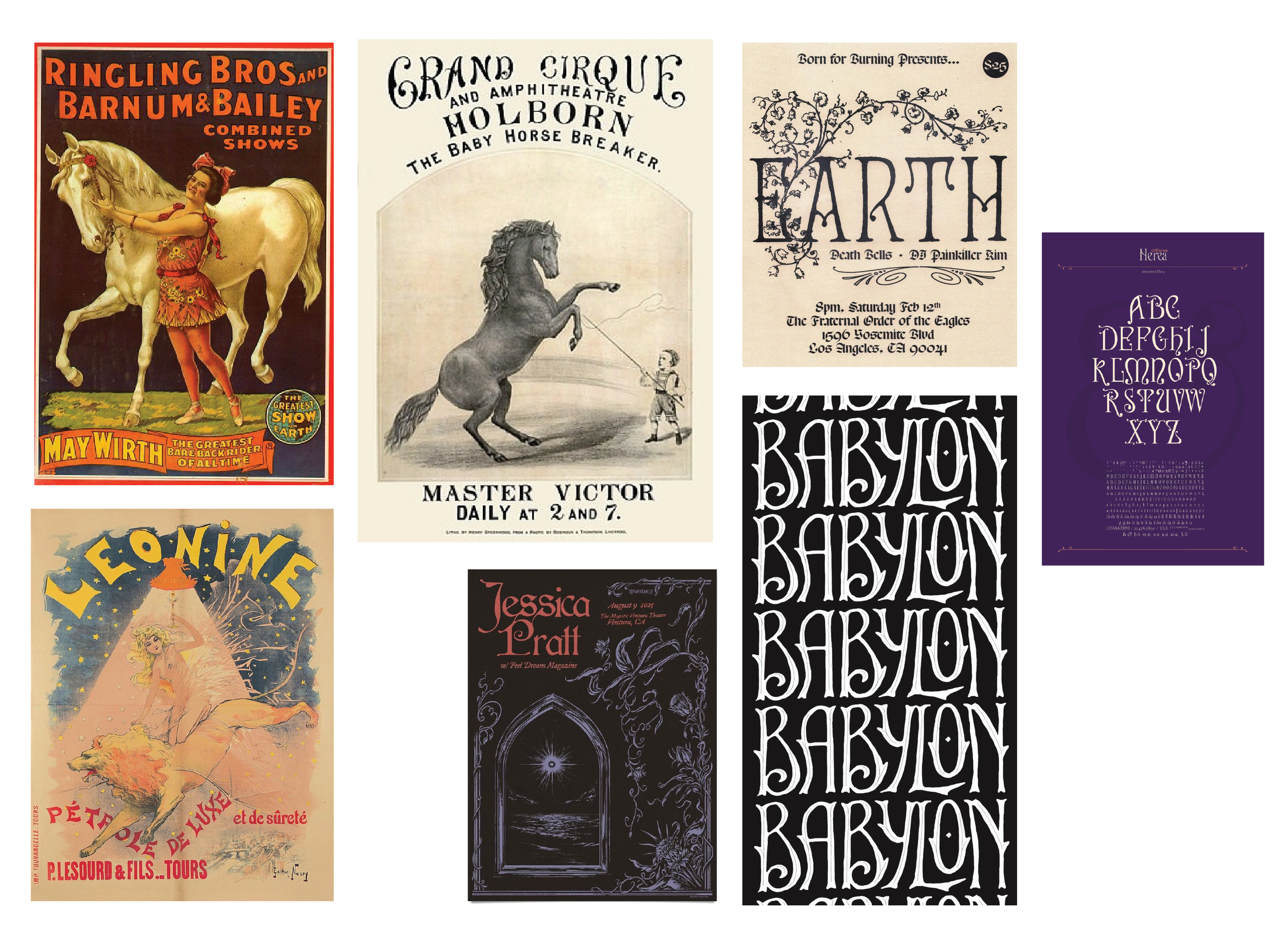
The type treatment felt like a natural decision but I didn’t want it to feel too obviously circus, as I was only trying to add a nod to it’s tie-in and less of a hit-you-on-the-head choice. Using subtle layouts of circus flyers with type reminiscent of art nouveau type that carries the kind of magical and mysterious nature with it’s nods to classical vampires, dark fantasy, and mysticism